Facebook has been pretty fast and loose with their changes over the past few months. They’ve updated the ads manager, power editor, conversion pixels… the list goes on.
With these updates in mind, I’ve created a Facebook Ad Creation checklist to ensure that you are able to make the best ad possible in the ads manager. And I’ve added a few ideas for strategy too.
For the purposes of this blog – I’m assuming you have your targeting options all sorted and you’re creating ads with the objective of getting website clicks or conversions.
〈 Check your landing page
And that you’re using some sort of tracking, through the audience pixel or a conversion pixel. The dropdown arrow will give you more options.
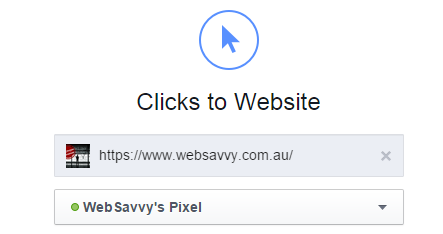
It’s really easy to get muddled up with the landing page since this option is so far removed from the ad creation aspect.

That’s a lot of space to forget what page your sending traffic to!
And it’s important to remember – unless you’re showing this ad to a retargeting/remarketing audience the content on the landing page should be packed full of engaging content. Sending cold traffic to a sales focused page is going to be expensive 90% of the time.
〈 Choose the right format for your ad

The multiple image ads (aka Multiple product ads, MPA’s or carousel ads) are the new thing in Facebook. You need at least three 600 x 600 images – and yes you can have all 3 hitting the same landing page. So you might consider promoting 3 benefits of your product in one ad. Or you can have 3 separate pages to send traffic
However, keep the concept of “ad clutter” in mind when doing this sort of ad. If it looks too busy or confusing, people are going to scroll/swipe right past it.
The single image ads are still working very well, and the bigger image size let you really hammer on one trigger or benefit.
〈 Pick your images

Here you can choose between an image or video. First, lets unpack images.
For images, you can use images from your Facebook page, stock images or upload your own. Facebook recommends 1200 x 628 and you should stick to their recommendations.
Stock images are fine if you’re in a pinch, but most of the people are too perfect. They’ve all got great skin, dazzling smiles and look to professional. Lots of businesses are having success with Facebook ads by appearing “native” – as in blending in to the newsfeed. The more an ad looks like an ad, the more it stands out and can be ignored.
Video is an option too – and if you’ve got it – use it! However, keep in mind the ultimate goal is to get people to your site. There’s a whole separate type of campaign objective geared to getting your video watched if views are what you’re after!
〈 Double Check Your Facebook Page
The more you work with Facebook ads it seems you end up collect access to Facebook pages like some people collect teaspoons.
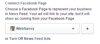
This is vital for two reasons. 1) you get the branding benefit of having a logo and your business name in the ad. 2) You’ll pick on more page likes.
Ad Copy
Ages ago I wrote about how using power editor lets you get more out of your ads, especially when it comes to copy. And it still does! But if you’re using the ads manager you can still overlook key elements.
〈 Headline & Text
Your Headline is going to appear under your image – you’ve got 25 characters to entice the click.
Try speaking to the physical or emotional benefit as a reason to click.
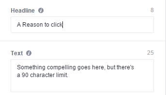
The text goes above your image – so this can act as a “pre headline”. And often people are scrolling through their newsfeed, they will likely see this before the headline, so make sure it is complementary!
〈 News Feed Link Description
“Hidden” under advanced options is where you can talk about a secondary benefit of your product or service. This will appear under your headline – so you can carry on from the headline and finish the sell.
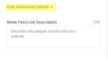
Be aware that your character count depends on placement & if you’re using a call to action! (next few checks)
〈 Call to Action
Adding a button to your Facebook Ad is going to increase the click through rate, incrementally but an increase none the less!
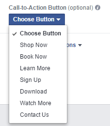
Just make sure the button is applicable – if you’ve got nothing to download, don’t use it! Experiment with “Learn More” as opposed to “Contact Us” or “Book Now”.
〈 Preview Preview Preview
Each placement is going to change the parameters of your ad.
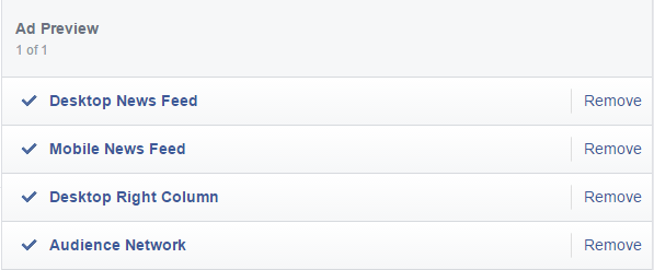
Check each one and make sure it doesn’t truncate (that’s fancy talk for “cut off”) your ad copy. Just one more reason to segment by placement!
〈 Double Check Your Link.
Look at your landing page and ask yourself, or someone else if you don’t think you can be trusted:
Does this page back up the promise the ad makes?
Ads that look fantastic are worthless if the landing page doesn’t have the same feel. People liked something about the ad, so that something needs to be reflected on the page too!
Is this Facebook Ad Creation Checklist missing anything? Let me know in the comments!


